Looking for B2B newsletter inspiration? Wondering what other top brands are doing with their content?
With Spotmar, the world’s largest library of marketing emails, we have over 300K emails from all industries for you to use when researching, strategizing, and optimizing your email campaigns.
Today, we wanted to share a curated list with examples of great B2B newsletters that we’ve found…as well as a few tips to help you get the most out of your email research.
I’m not sure why the stereotypical B2B newsletter is dense, dry, and looks like it was designed in 1997….especially when the competition is made up of cutting-edge marketing teams, bold startups, and a customer base that is, quite frankly, tired of the noise.
Fortunately, the more you double down on the fundamentals of what makes a valuable piece of content (engaging, informative, etc.), the easier it is to create something worth opening in an inbox.
When looking for great newsletter examples, you’ll want to take note of a few different factors, since an email with great design isn’t always one with standout messaging. The top 3 things to look at include:
As mentioned, Spotmar is the world’s largest library of marketing emails. It’s an incredible app that allows marketers to conduct email marketing research, whether you’re looking for design or copy inspiration, doing some competitor research, or want to track top brands to see what they’re sending out on a regular schedule.
Sign up for a free account to get started searching for—and collecting—top email examples today.
A note: why it’s important to go beyond curated lists to find email inspiration
Curated lists in blog posts like this are only a tiny segment of what’s really going on in the world of email marketing. While they do have value in terms of delivering visual inspiration, they tend to lack depth and contextual information…like when the email was sent, the send frequency, etc.
To help with this shortcoming, we included links throughout the article to the email details page in Spotmar, so you can do a deep dive into the email itself.
As promised, here’s our roundup of some great examples of B2B newsletters—with a standard disclaimer that we are not affiliated with any of the companies listed.

What’s great about this email:
This is a classic webinar pitch that does a lot of things right. To start off with, the header image is cleanly designed in a way that’s able to present a lot of information without being overwhelming, as well as a clear CTA. The copy that follows maintains the same balance, with a strong textual hook, followed by a very practical rundown of what to expect in the webinar and a clear CTA for easy registration.
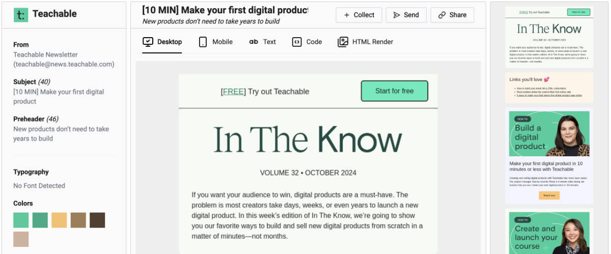
What’s great about this email:
This particular email is quickly digestible, using a bright yet subtle branded palette to create an attractive array of highly scannable content. Each section is brief and to-the-point, with a mix of larger headings and smaller body text to establish a strong content hierarchy. In general, I’ve noticed that they tend to stay in the range of 6-10 links per newsletter, which gives enough variety to keep things interesting, without risking overwhelm.
View the full email here in Spotmar

What’s great about this email:
Put Seth Godin’s face on anything, and marketers will pay attention, which is why this announcement-style newsletter is such an easy hook. The pitch in the content is for a new webinar series, using the first in the series—with Seth Godin—as the lead in. It’s a compelling incentive for readers who want to level up their strategy.
See the full email on Spotmar.
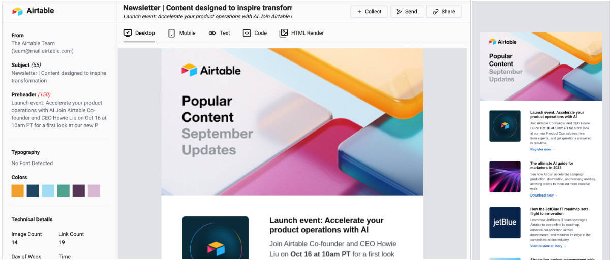
What’s great about this email:
In a world of alternating layouts (left column image in row 1, right column image in row 2), Airtable opts for pure scannability, which makes this email feel extremely content-rich (even though there are “only” five links), without any kind of overwhelm. Bonus points for the clear CTA-style links that tell you exactly what kind of content you’re about to click into.
See the full email in Spotmar.
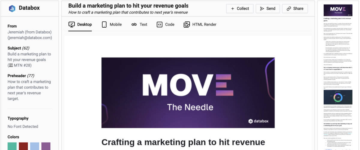
What’s great about this email:
This email manages to create strong CTAs for not one…not two…but *three* separate actions. The email is actually a great piece of longer-form content that you usually see in a more Substack-like newsletter. The writing is engaging, moving from a hook-like synopsis to a run-down of the top highlights from the interview in question, along with an eventual CTA button that directs readers to the interview…another CTA near the end that invites them to register for the *next* scheduled interview, and a final CTA for a free trial.
See the full email in Spotmar.
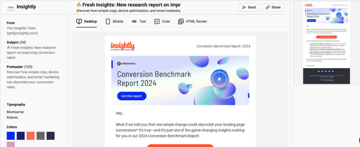
What’s great about this email:
Reports can be wildly useful…so why do I tend to ignore them? It’s because they seem like a lot of work.
A pro when it comes to turning something complex into a digestible, enjoyable experience, Insightly uses bright colors, strong CTA buttons, and some targeted highlighted takeaways to make their report feel useful and less overwhelming. (Compare the way Insightly presents their sneak peek/takeaways with the more general hints in Disqo’s 2024 holiday marketing report email, for example.)
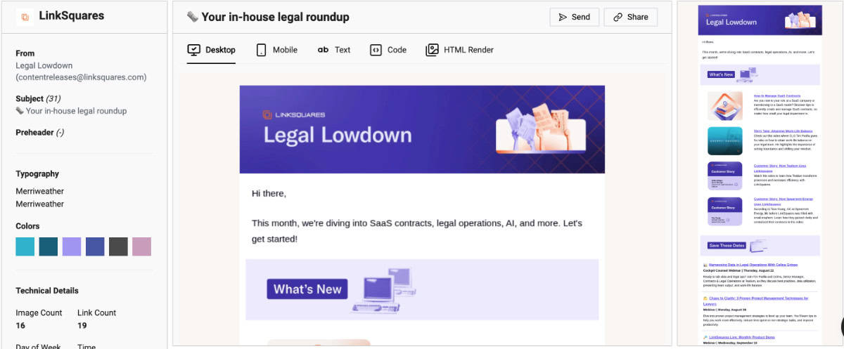
What’s great about this email:
I wasn’t familiar with LinkSquares before finding this newsletter, but was immediately struck by the clean layout that somehow manages to make it fun to scroll through 16 images and 19 total links. The content hierarchy is thoughtfully arranged, with clearly labeled sections that help readers know exactly what they’re looking at (latest news, webinar events, and short but snappy article highlights at the very end).
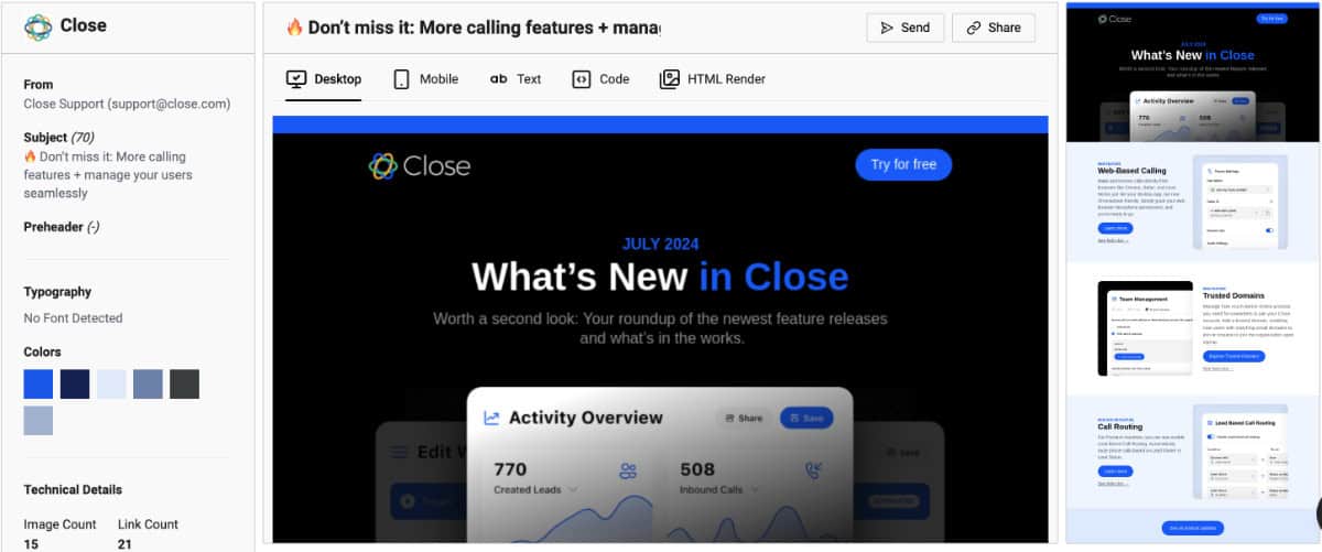
What’s great about this email:
I highlighted Airtable’s newsletter in this roundup for its multi-post layout…and was equally impressed with this newsletter from Close which uses an alternating two-column layout.
All too often, the alternating two-column layout is dizzying and messy looking. Close succeeds with theirs thanks to simplified imagery, good padding, and a nice balance of text-to-image ratio.
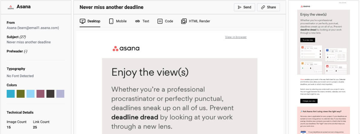
What’s great about this email:
Product-focused emails are incredibly difficult to write, and are often either too salesy, too technical, or too company-focused. With this email, Asana shows us how it’s done, starting with a relatable hook, a quick recap of what the feature does, and wrapping up with some strategy-focused FAQ’s that pair feature tips with project management best practices.
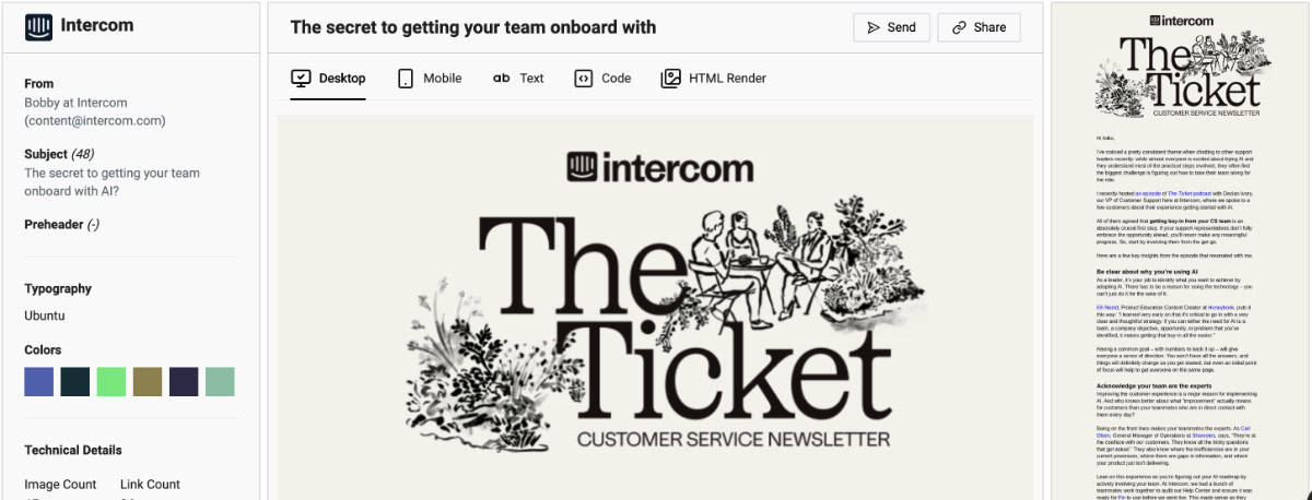
What’s great about this email:
Intercom’s latest rebrand has a refined, almost editorial vibe…and one that they’ve fully embraced with their newsletter, The Ticket. The off-white background, elaborate header, and long-form content deliver an experience that feels like you’re reading an old-timey periodical. It’s bold, yet elegant.
See the full email in Spotmar.
I hope you’ve enjoyed this latest roundup of great B2B newsletters—and that you find some inspiration for your own newsletter and email marketing projects.
If you want to dive deep and find more emails like this, definitely check out the massive library (over 300K emails at the time this blog post was published) at Spotmar.com.