ColourPop Cosmetics Email Examples
Explore ColourPop Cosmetics's email marketing campaigns and get inspiration for your own campaigns.
ColourPop Cosmetics Email Examples & Analysis
✨ Explore New Beta Features ✨
Discover our new beta feature, Trends, which provides deeper insights into a company's email practices. Gain access to detailed analytics and trends to enhance your understanding of email strategies.View ColourPop Cosmetics TrendsCompany Info:
ColourPop Cosmetics (private)Company Description:
ColourPop was born, raised and made with love in the City of Angels. Founded in 2014 by Seed Beauty, we pride ourselves on being wallet friendly and bunny approved. We test our products in the nicest way possible, leaving fur babies to be fur babies and experimenting on people instead (the people at ColourPop HQ to be exact!). We like long walks on the beach, sipping margaritas, swatching Lippies in the moonlight, and oops, got a little sidetracked! Back to business. Trends come and go, so it’s super important to us that you can keep up with this ever-changing industry without breaking the bank. You can try out the latest trends without serious commitment because our luxury formulas are priced for experimentation. They’re also, like, really pretty. We’re dedicated to creating the best possible products in every shade imaginable for our loyal ColourPoppers & ColourPopettes.Industry Tags:
Tips for Creating Emails Like ColourPop Cosmetics
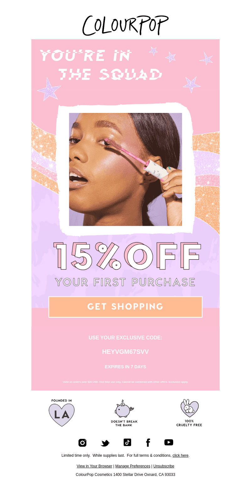
Company's Email marketing strategy for ColourPop Cosmetics focuses on delivering vibrant, engaging, and trend-forward content that resonates with their youthful and fashion-forward audience. The emails are designed to capture the essence of their colorful product range, ensuring that each communication feels fresh, exciting, and relevant. Through a combination of bold visuals and catchy subject lines, ColourPop successfully draws attention to new collections, special promotions, and exclusive offers, leveraging a sense of urgency and excitement to entice customers to engage.
ColourPop Cosmetics' email design embodies a lively and dazzling approach that aligns perfectly with their brand identity. Vibrant images, playful fonts, and a cohesive color palette create a visually delightful experience for the reader. The design elements are thoughtfully integrated to highlight key messages, making the call-to-action prominent and engaging. Consistency in branding and a clear layout help ensure that the emails are both pleasant to look at and easy to navigate.
- Use Vibrant Colors: Choose a color palette that reflects your brand identity and engage your audience visually.
- Bold Typography: Use playful and trendy fonts to make your message stand out and keep it readable.
- Strong Imagery: Incorporate high-quality images that showcase your products in the best light possible.
- Consistent Branding: Align your emails with brand aesthetics for a cohesive look across all communications.
- Clear Call-to-Action: Make your CTAs easy to find and encourage interaction.
- Emphasize Key Offers: Highlight any discounts or special offers to create a sense of urgency.
- Mobile Optimization: Ensure your emails are responsive and easy to read on mobile devices since many users will check emails on the go.
- Engaging Content: Keep your message concise but engaging, using language that resonates with your audience.