Sanity Email Examples
Explore Sanity's email marketing campaigns and get inspiration for your own campaigns.
✨ Explore New Beta Features ✨
Discover our new beta feature, Trends, which provides deeper insights into a company's email practices. Gain access to detailed analytics and trends to enhance your understanding of email strategies.View Sanity TrendsCompany Info:
Sanity (private)Company Description:
The Sanity Composable Content Cloud is the modern content management system chosen by industry-leading companies like PUMA, AT&T, Burger King, Tata, and Figma. Sanity creates competitive advantage by optimizing content experiences and operational efficiency across marketing, support, e-commerce, and more. Backed by an unparalleled developer experience, Sanity is fully composable through APIs that sync any data source, enrich content, and connect to all distribution channels. As the most customizable content platform available, developers have the freedom to build content management interfaces that maximize teams’ efficiency and impact. Learn more: sanity.io Try it out: sanity.io/get-started Join the community: slack.sanity.io Follow us on Twitter: @sanity_io Questions? [email protected]Industry Tags:
Tips for Creating Emails Like Sanity
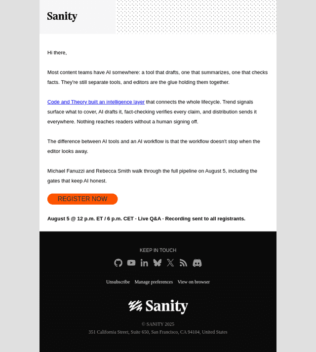
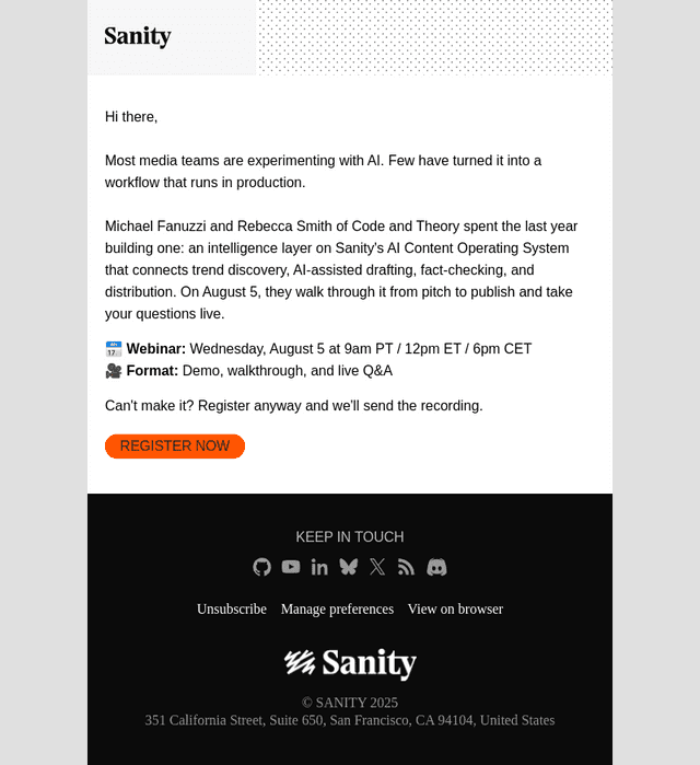
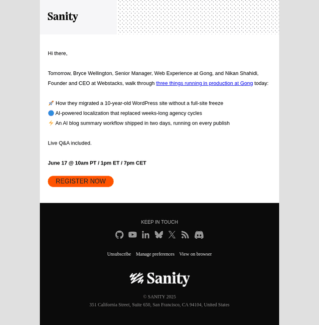
Company's Email strategy focuses on engaging its audience by providing valuable content that resonates with their interests and needs. The emails often highlight the unique features and benefits of using Sanity.io's platform, aiming to establish a deep connection with potential and existing customers. By aligning their messaging with the current industry trends and customer challenges, the company succeeds in creating a sense of urgency and excitement around their offerings. Their strategy ensures that each email not only informs but also inspires action, whether it's clicking through to learn more, signing up for a webinar, or trying out their service.
The company's email style and design are characterized by clean, modern aesthetics combined with clear messaging that captures the recipient's attention swiftly. Emails are designed to be visually appealing and easy to navigate, ensuring a delightful user experience. The content is structured to guide the reader naturally towards a call to action, using a harmonious balance of images and text. This approach is designed to complement the brand's innovative image while making the information easily digestible.
- Keep it clean: Use a minimalistic design with plenty of white space to avoid overwhelming your audience.
- Clear messaging: Ensure your main message is easily identifiable and concisely delivered.
- Visual appeal: Incorporate high-quality images that align with your brand's aesthetic and message.
- Structured layout: Organize content in a way that naturally directs the reader's eye to the desired actions.
- Consistent branding: Maintain color schemes and typography that reflect your brand's identity.
- Responsive design: Optimize your emails for viewing on mobile devices.
- Engaging calls to action: Use buttons or highlighted text to guide readers towards taking the next step.
- Personalization: Tailor content and subject lines to your audience's specific needs and interests.